Be honest. How excited were you when you saw this blog? Super excited? We know.
And you should be! The last time we wrote about summer color palettes, it was a huge hit. So, of course, we decided we absolutely had to do it again.
Here are our summer color picks for design in 2019, paired with some songs that are sure to spur some nostalgia. Check out these palettes, and then go grab your shades. It’s time to celebrate all summers, past and present, in style.
We’re Gonna Soak Up the Sun…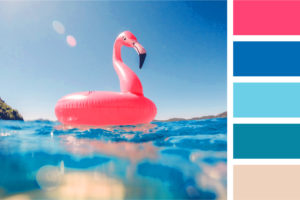
…We’re gonna tell everyone to lighten up!
Nothing says “summer fun in the sun” quite like a flamingo inner tube in a bright blue pool. Just looking at this palette makes us feel relaxed and about ten degrees cooler.
Have you ever heard that old phrase, “opposites attract?” That’s the idea behind this palette. Blue and pink play off of each other in a way that is distinctly modern, fresh, and exciting. With both pastel and bolder options, this color scheme would be great for any pool party or even a fun corporate event. Don’t you just want to dive right in?
Ooh, We Wanna Take You…
…Bermuda, Bahama, come on pretty mama!!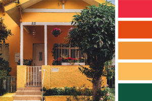
What? Don’t you spontaneously break into song, too?
Anyway, that’s exactly what this palette reminds us of: a nice little summer home on a beach, campfires in the sand, with a glass of iced red wine and summer oldies playing in the background (Edit: Our younger staff members just called “Kokomo” an oldie. It came out in 1988. We’ve never felt older in our lives than we do right now).
This versatile color palette contrasts a dark, rich green with the colors of sand and a sunset. Use this for evening beach parties, bonfires, and any other laid-back event that includes relaxing on the sand with a piña colada in hand.
Summer Days Drifting Away…
…to oh, oh the summer… (take that big breath!)…niiii-hiiiiiiiights!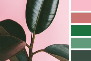
This palette just screams sitting on the hood of an old beater and watching the sky turn pink at the end of the day. Honestly, just writing that sentence got us nostalgic for all those teenage summer nights. What about you?
Use this on anything that needs a cool, vintage feel. The muted teal and pastel pink keep things cheerful and cool, while the darker pink and forest green can really captivate your viewers’ most cherished summer memories. Try this for formal invitations, business gatherings, and throwback parties.
Need an agency that can tell you more, tell you more…tell youuuuuu moooore? (Okay. No more Grease references. We promise.) Then you’re in the right place. We keep the fun of summer around all year, all while working hard so that you can relax and enjoy the good times. Reach out to us today. We’d love to grab a drink and learn about your goals.


