Typography is absolutely essential to every project a designer creates: layout, composition, brand identity, etc., because type can convey almost any message to your audience. An image, graphic, or other elements a designer uses can present one message on its own and take on a totally different meaning when paired with different fonts, used in different ways. Fonts themselves are similar in this aspect. Working on a project that requires type pairing, like developing a new identity, can be challenging and extremely time consuming because there are millions of fonts to chose from.
Choosing a direction for a primary font can be obvious, sometimes you know exactly what works. You can look at a design, brand, or message and associate that with a certain type of font, whether serif, sans serif, bold, light, condensed, extended, etc. However, your design also requires a secondary font in contrast to the headline font, for use in subheads, body copy, and other areas of text. Along with size, proximity, position, and color, font choice is crucial to creating hierarchy and organization within a composition.
Not all fonts are appropriate when used in conjunction with one another. Finding a font that compliments the overall feeling that is being communicated is more complex. Secondary fonts can easily manipulate the voice of the primary font. So it is important to know how to pair in order to create the appropriate combination for the individual project. One type combination may be gold for your current project, but look ridiculous with another.
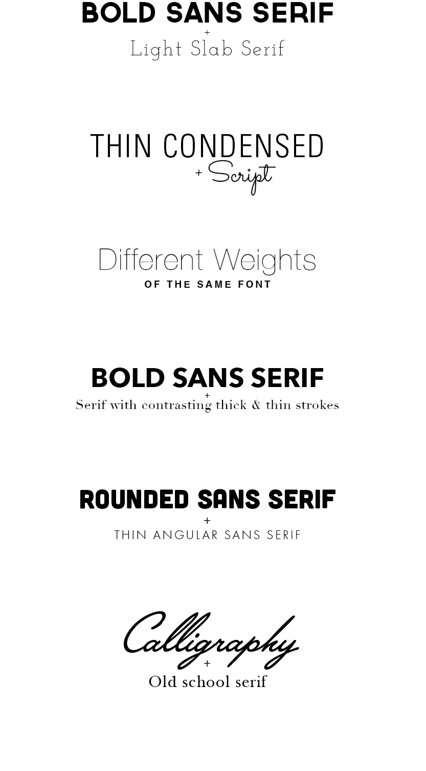
Designers, especially those living the agency life, rarely have the time to devote hours to finding that perfect font combo. So by streamlining that process, and creating a guide to narrow down the search, things go a bit smoother. There are fonts of different categories that just work well when paired with each other. Not all fonts in each category apply of course, but narrowing down your search from the get-go saves you some time. So, during your font search always remember:
– Contrast is key
– Some people say opposites attract… however, fonts that communicate different tones or feelings often
create too much conflict
– Fonts that are too similar also create awkwardness and are disruptive to your design
Combinations of the following are a great place start:
Did You License That?
Navigating the legalities of fonts can be a perplexing endeavor, particularly for busy entrepreneurs and marketers striving to make their content shine in the crowded


